dani monter

Reducing onboarding drop-offs on Upnotch
Upnotch is a mentorship platform that connects mentees with mentors to enable knowledge sharing. During one of our data reviews, we noticed a significant problem: nearly 50% of users who started the onboarding process never completed it. Acquiring users was challenging, and we didn’t want to lose them during onboarding. To improve retention and help new users reach their first moment of value, we redesigned the onboarding experience to make it shorter, clearer, and more engaging.
UX Research
Strategy
KPIs
Web
UI Design
Mobile
Company
Upnotch
Year
2024
Role
UX/UI Designer
The problem

Upnotch’s onboarding process had a high drop-off rate, with half of the users leaving before completing it.
After analyzing data and observing user behavior, we identified several key issues:

Too much data requested
The onboarding asked for many details from users before they understood the benefit of the app; information they could easily add later to their profiles if needed.

Approval method generated a friction point
After finishing the onboarding, users had to wait for approval, which created a major frustration point since they expected to start using the app immediately.

Cognitive overload in large text fields
The onboarding included long text fields (e.g., bio) that created friction, especially for mentors, who didn’t know what to write during the process; causing a high drop-off rate at that stage.
The process
Understanding user behavior, struggles, and prioritizing what matters for the business and the users
We began by analyzing our metrics in the admin panel to identify the step where we lost the most users and found two main issues. We were losing people on the Employment page and the Bio page, where there was cognitive overload from large text fields or questions users didn’t know how to answer (e.g., “Department” in employment). After reviewing these metrics, we also gathered feedback from users through direct messaging and several user interviews, where we discovered additional issues such as login difficulties (caused by having only one login method) and frustration with the approval waiting period.
After understanding the issues, we decided to create a user journey based on the previous onboarding flow. We mapped out each step, the information requested, and the potential issues to address.
Part 1: Introduction
Content:
- Login with magic link
😐
Issues found:
- The image didn’t communicate what Upnotch is
- An alternative login method was needed for users struggling with the magic link
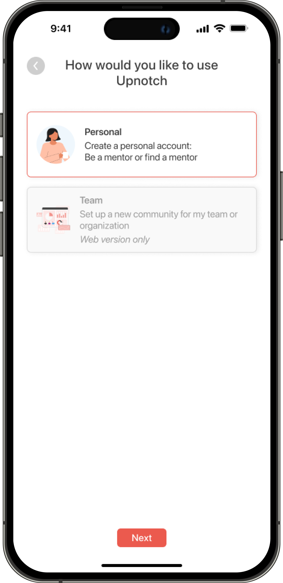
Part 2: Upnotch role/ guidelines
Content:
- Our guidelines
- Upnotch use (Create a team or be a mentor/mentee)
😄
Issues found:
- Text revisions were needed in the “How would you like to use Upnotch?” section so users could better understand the difference between B2B and B2C
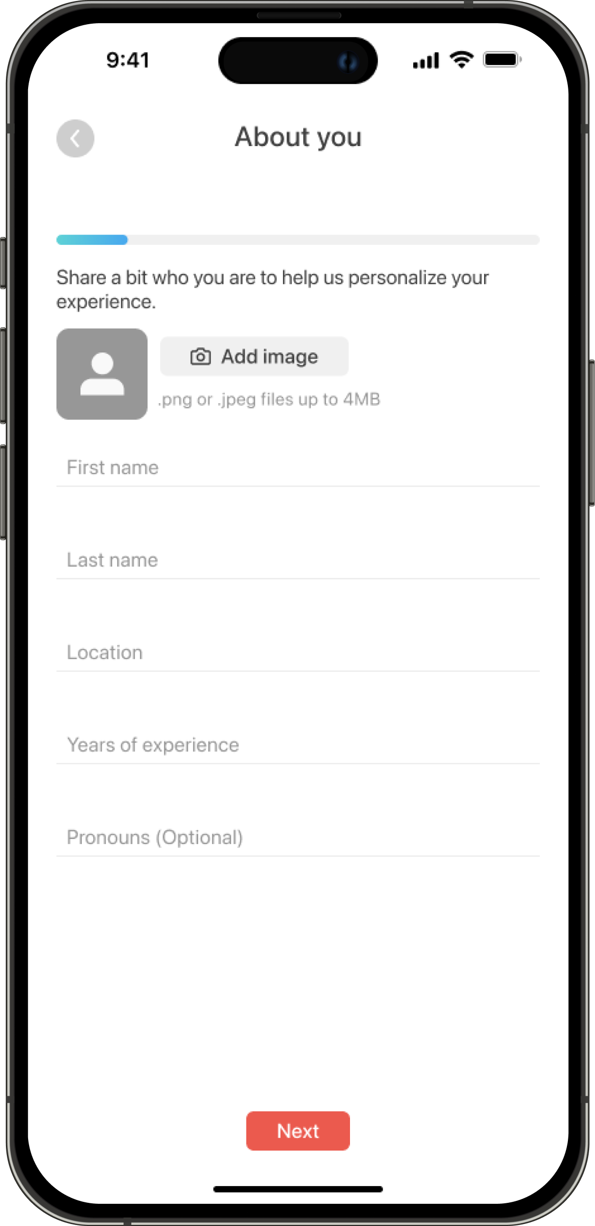
Part 3: About you
Content:
- Basic information
- Location
- Recent employment
- Experience
- Interests
- LinkedIn URL
😄
Issues found:
- The number of screens could be reduced
- Users didn’t know what “Department” meant in the employment section
- Not all of this information was necessary to create a profile
Part 4: Mentor flow (optional)
Content:
- Choose a role (mentor or mentee). If they choose mentee, they skip the rest of the steps
- Write your bio (biggest drop)
- Skills and tools
- Set weekly hours
- Connect calendar
😐
Issues found:
- Users weren’t finishing their bios
- The process felt like too much work before completion
Part 5: First actions
Content:
- Find a mentor (Using AI, find a mentor)
- Onboarding wizard (Mentor and mentee versions)
😐
Issues found:
- We assumed mentors would also want to find mentors
- We added an unnecessary extra step for users to complete
Design and implementation
Making onboarding faster using AI
We reduced the number of screens and replaced long text fields with smart defaults. For example, mentors now receive an AI-generated bio suggestion that they can edit or replace instead of writing it from scratch.
This reduced cognitive load and helped users progress more smoothly through the process.

Component added to the onboarding where users can choose to auto-generate their bio with AI
Delaying verification to build early engagement
Previously, users needed approval before they could access the platform; they were stopped until this process was complete.We modified this by allowing users to explore the app right after onboarding, even while their profiles were still being verified. They could browse mentors or mentees, see example profiles, and better understand the platform’s value.
Introducing personalized AI mentor suggestions
To make onboarding feel more rewarding, we added an AI-driven recommendation step that suggests potential mentors (for mentees) or relevant skills (for mentors) based on their job title.
This gave users an immediate sense of personalization and value before their profiles were even approved.
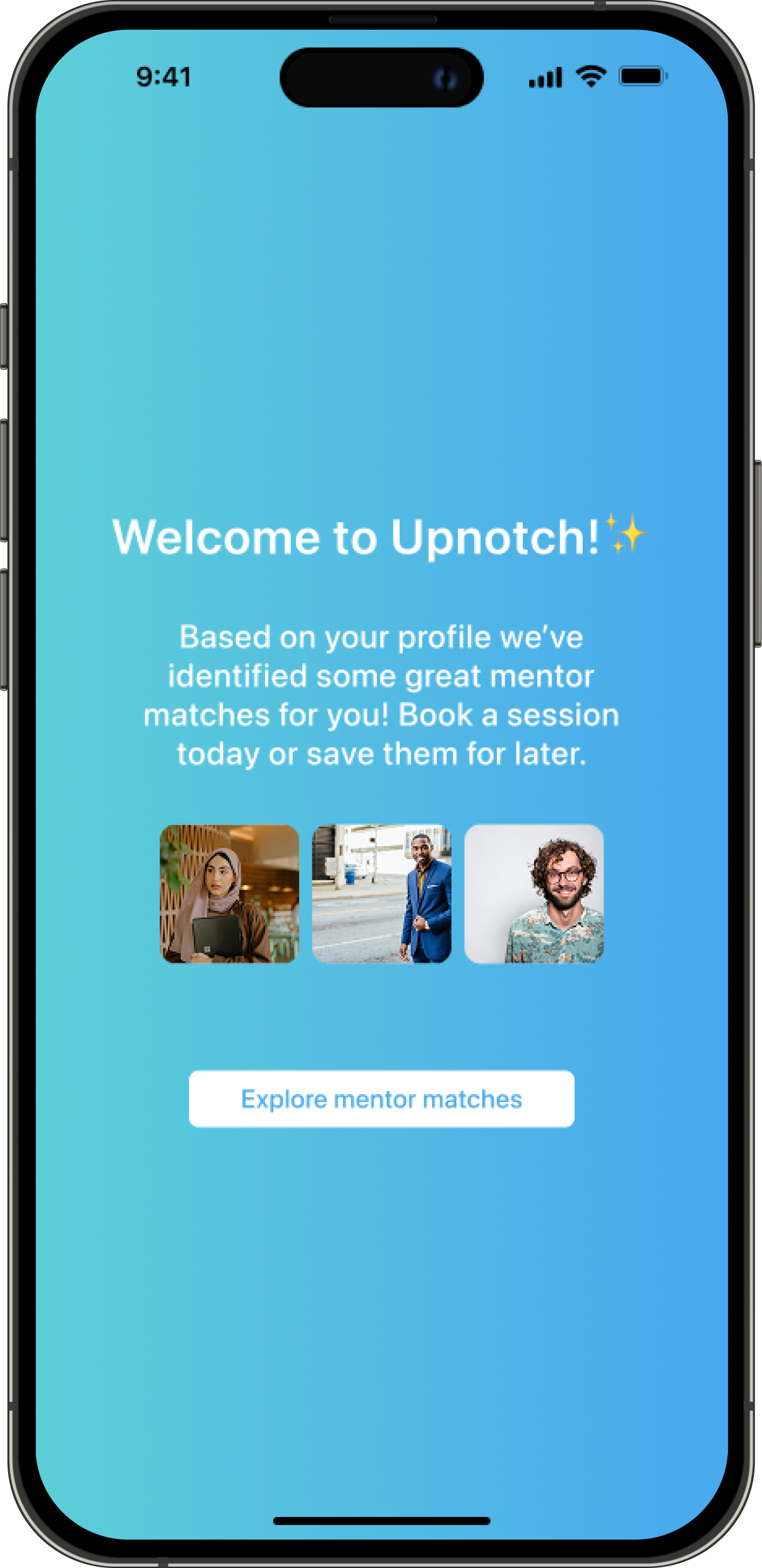
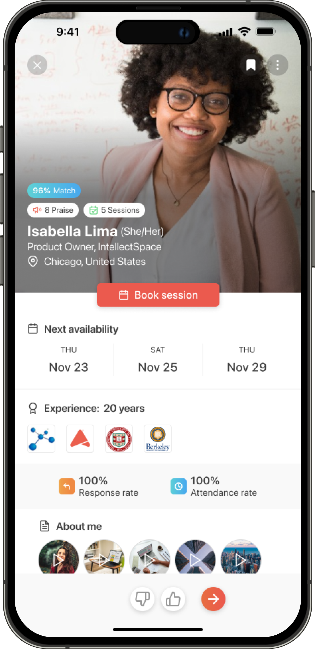
Direct access to the Upnotch platform and the AI Match feature for mentor recommendations
Outcome & lessons learned
The new onboarding experience reduced drop-offs by 25%, marking significant progress in user retention.
Members now complete onboarding more frequently and are more likely to explore the app immediately afterward. From this project, we learned the importance of showing early value to users to gain their trust. It also highlighted the value of having measurable data across the app to identify potential issues early on.
Everything in this project was built as a team effort. As the only designer, I was responsible for refining ideas and delivering final designs and solutions; but many of the best ideas emerged through close collaboration with key stakeholders and developers.
dani monter
Home
Reducing onboarding drop-offs on Upnotch
Upnotch is a mentorship platform that connects mentees with mentors to enable knowledge sharing. During one of our data reviews, we noticed a significant problem: nearly 50% of users who started the onboarding process never completed it. Acquiring users was challenging, and we didn’t want to lose them during onboarding. To improve retention and help new users reach their first moment of value, we redesigned the onboarding experience to make it shorter, clearer, and more engaging.
UX Research
Strategy
KPIs
Web
UI Design
Mobile

Company
Upnotch
Year
2024
Role
UX/UI Designer

The problem

Upnotch’s onboarding process had a high drop-off rate, with half of the users leaving before completing it.
After analyzing data and observing user behavior, we identified several key issues:
Too much data requested
The onboarding asked for many details from users before they understood the benefit of the app; information they could easily add later to their profiles if needed.
Approval method generated a friction point
After finishing the onboarding, users had to wait for approval, which created a major frustration point since they expected to start using the app immediately.
Cognitive overload in large text fields
The onboarding included long text fields (e.g., bio) that created friction, especially for mentors, who didn’t know what to write during the process; causing a high drop-off rate at that stage.
The process
Understanding user behavior, struggles, and prioritizing what matters for the business and the users
We began by analyzing our metrics in the admin panel to identify the step where we lost the most users and found two main issues. We were losing people on the Employment page and the Bio page, where there was cognitive overload from large text fields or questions users didn’t know how to answer (e.g., “Department” in employment). After reviewing these metrics, we also gathered feedback from users through direct messaging and several user interviews, where we discovered additional issues such as login difficulties (caused by having only one login method) and frustration with the approval waiting period.
After understanding the issues, we decided to create a user journey based on the previous onboarding flow. We mapped out each step, the information requested, and the potential issues to address.
Part 1: Introduction
Content:
- Login with magic link
😐
Issues found:
- The image didn’t communicate what Upnotch is
- An alternative login method was needed for users struggling with the magic link
Part 2: Upnotch role/ guidelines
Content:
- Our guidelines
- Upnotch use (Create a team or be a mentor/mentee)
😄
Issues found:
- Text revisions were needed in the “How would you like to use Upnotch?” section so users could better understand the difference between B2B and B2C
Part 3: About you
Content:
- Basic information
- Location
- Recent employment
- Experience
- Interests
- LinkedIn URL
😄
Issues found:
- The number of screens could be reduced
- Users didn’t know what “Department” meant in the employment section
- Not all of this information was necessary to create a profile
Part 4: Mentor flow (optional)
Content:
- Choose a role (mentor or mentee). If they choose mentee, they skip the rest of the steps
- Write your bio (biggest drop)
- Skills and tools
- Set weekly hours
- Connect calendar
😐
Issues found:
- Users weren’t finishing their bios
- The process felt like too much work before completion
Part 5: First actions
Content:
- Find a mentor (Using AI, find a mentor)
- Onboarding wizard (Mentor and mentee versions)
😐
Issues found:
- We assumed mentors would also want to find mentors
- We added an unnecessary extra step for users to complete
Design and implementation
Making onboarding faster using AI
We reduced the number of screens and replaced long text fields with smart defaults. For example, mentors now receive an AI-generated bio suggestion that they can edit or replace instead of writing it from scratch.
This reduced cognitive load and helped users progress more smoothly through the process.
Component added to the onboarding where users can choose to auto-generate their bio with AI
Delaying verification to build early engagement
Previously, users needed approval before they could access the platform; they were stopped until this process was complete.We modified this by allowing users to explore the app right after onboarding, even while their profiles were still being verified. They could browse mentors or mentees, see example profiles, and better understand the platform’s value.
Introducing personalized AI mentor suggestions
To make onboarding feel more rewarding, we added an AI-driven recommendation step that suggests potential mentors (for mentees) or relevant skills (for mentors) based on their job title.
This gave users an immediate sense of personalization and value before their profiles were even approved.
Direct access to the Upnotch platform and the AI Match feature for mentor recommendations
Outcome & lessons learned
The new onboarding experience reduced drop-offs by 25%, marking significant progress in user retention.
Members now complete onboarding more frequently and are more likely to explore the app immediately afterward. From this project, we learned the importance of showing early value to users to gain their trust. It also highlighted the value of having measurable data across the app to identify potential issues early on.
Everything in this project was built as a team effort. As the only designer, I was responsible for refining ideas and delivering final designs and solutions; but many of the best ideas emerged through close collaboration with key stakeholders and developers.
dani monter
Home
Reducing onboarding drop-offs on Upnotch
Upnotch is a mentorship platform that connects mentees with mentors to enable knowledge sharing. During one of our data reviews, we noticed a significant problem: nearly 50% of users who started the onboarding process never completed it. Acquiring users was challenging, and we didn’t want to lose them during onboarding. To improve retention and help new users reach their first moment of value, we redesigned the onboarding experience to make it shorter, clearer, and more engaging.
UX Research
Strategy
KPIs
Web
UI Design
Mobile
Company
Upnotch
Year
2024
Role
UX/UI Designer
The problem

Upnotch’s onboarding process had a high drop-off rate, with half of the users leaving before completing it.
After analyzing data and observing user behavior, we identified several key issues:
Too much data requested
The onboarding asked for many details from users before they understood the benefit of the app; information they could easily add later to their profiles if needed.
Approval method generated a friction point
After finishing the onboarding, users had to wait for approval, which created a major frustration point since they expected to start using the app immediately.
Cognitive overload in large text fields
The onboarding included long text fields (e.g., bio) that created friction, especially for mentors, who didn’t know what to write during the process; causing a high drop-off rate at that stage.
The process
Understanding user behavior, struggles, and prioritizing what matters for the business and the users
We began by analyzing our metrics in the admin panel to identify the step where we lost the most users and found two main issues. We were losing people on the Employment page and the Bio page, where there was cognitive overload from large text fields or questions users didn’t know how to answer (e.g., “Department” in employment). After reviewing these metrics, we also gathered feedback from users through direct messaging and several user interviews, where we discovered additional issues such as login difficulties (caused by having only one login method) and frustration with the approval waiting period.
After understanding the issues, we decided to create a user journey based on the previous onboarding flow. We mapped out each step, the information requested, and the potential issues to address.
Part 1: Introduction
Content:
- Login with magic link
😐
Issues found:
- The image didn’t communicate what Upnotch is
- An alternative login method was needed for users struggling with the magic link
Part 2: Upnotch role/ guidelines
Content:
- Our guidelines
- Upnotch use (Create a team or be a mentor/mentee)
😄
Issues found:
- Text revisions were needed in the “How would you like to use Upnotch?” section so users could better understand the difference between B2B and B2C
Part 3: About you
Content:
- Basic information
- Location
- Recent employment
- Experience
- Interests
- LinkedIn URL
😄
Issues found:
- The number of screens could be reduced
- Users didn’t know what “Department” meant in the employment section
- Not all of this information was necessary to create a profile
Part 4: Mentor flow (optional)
Content:
- Choose a role (mentor or mentee). If they choose mentee, they skip the rest of the steps
- Write your bio (biggest drop)
- Skills and tools
- Set weekly hours
- Connect calendar
😐
Issues found:
- Users weren’t finishing their bios
- The process felt like too much work before completion
Part 5: First actions
Content:
- Find a mentor (Using AI, find a mentor)
- Onboarding wizard (Mentor and mentee versions)
😐
Issues found:
- We assumed mentors would also want to find mentors
- We added an unnecessary extra step for users to complete
Design and implementation
Making onboarding faster using AI
We reduced the number of screens and replaced long text fields with smart defaults. For example, mentors now receive an AI-generated bio suggestion that they can edit or replace instead of writing it from scratch.
This reduced cognitive load and helped users progress more smoothly through the process.
Component added to the onboarding where users can choose to auto-generate their bio with AI
Delaying verification to build early engagement
Previously, users needed approval before they could access the platform; they were stopped until this process was complete.We modified this by allowing users to explore the app right after onboarding, even while their profiles were still being verified. They could browse mentors or mentees, see example profiles, and better understand the platform’s value.
Introducing personalized AI mentor suggestions
To make onboarding feel more rewarding, we added an AI-driven recommendation step that suggests potential mentors (for mentees) or relevant skills (for mentors) based on their job title.
This gave users an immediate sense of personalization and value before their profiles were even approved.
Direct access to the Upnotch platform and the AI Match feature for mentor recommendations
Outcome & lessons learned
The new onboarding experience reduced drop-offs by 25%, marking significant progress in user retention.
Members now complete onboarding more frequently and are more likely to explore the app immediately afterward. From this project, we learned the importance of showing early value to users to gain their trust. It also highlighted the value of having measurable data across the app to identify potential issues early on.
Everything in this project was built as a team effort. As the only designer, I was responsible for refining ideas and delivering final designs and solutions; but many of the best ideas emerged through close collaboration with key stakeholders and developers.